Smart Panda website, Quick redesign.
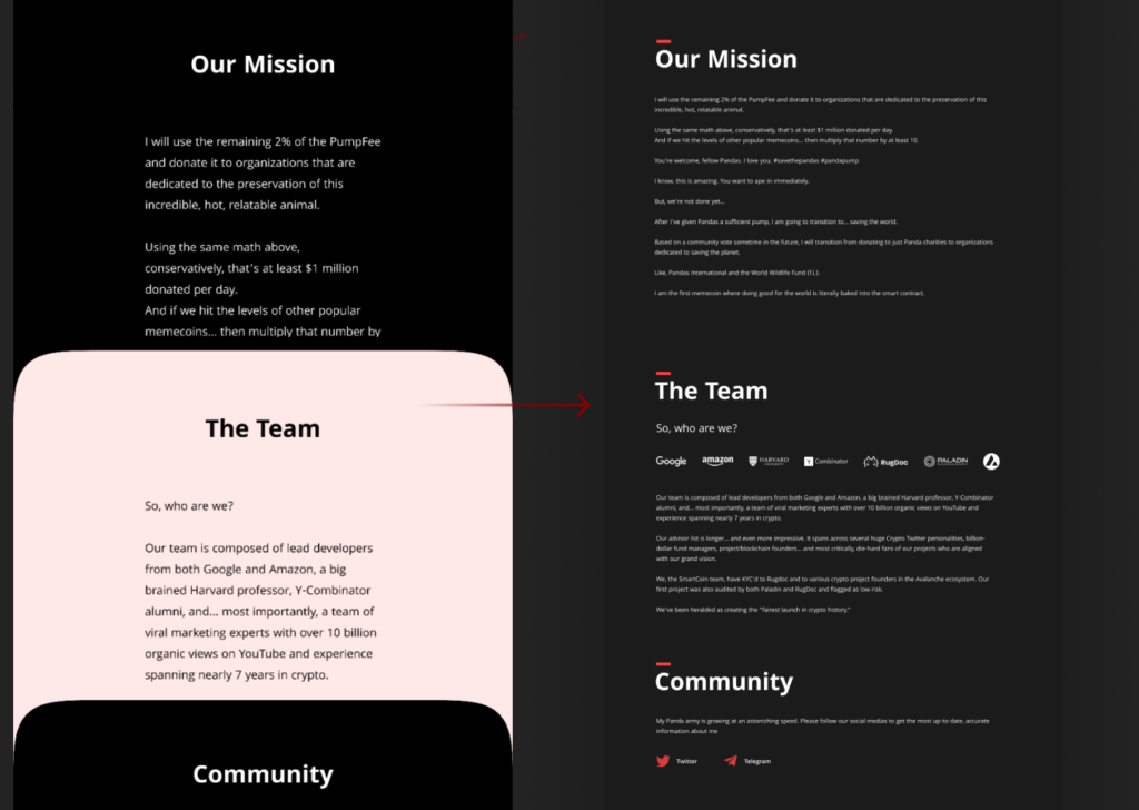
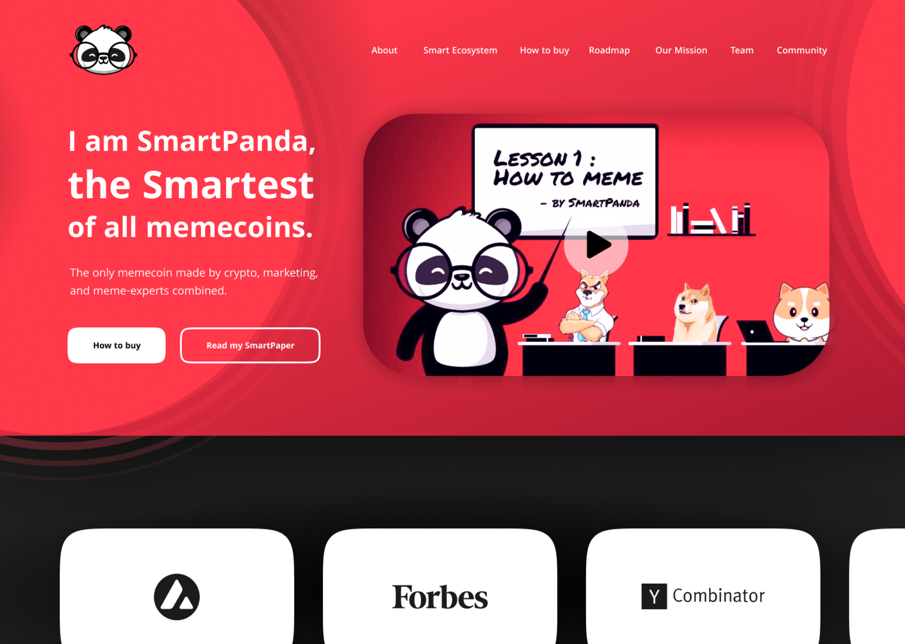
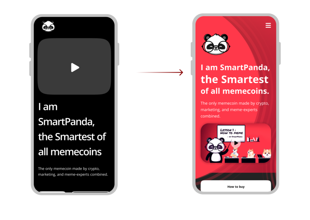
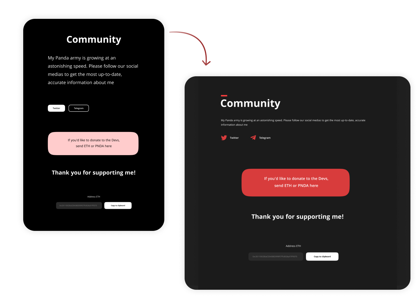
Main request keep red and black colors. Keep all content, but make it looks better.
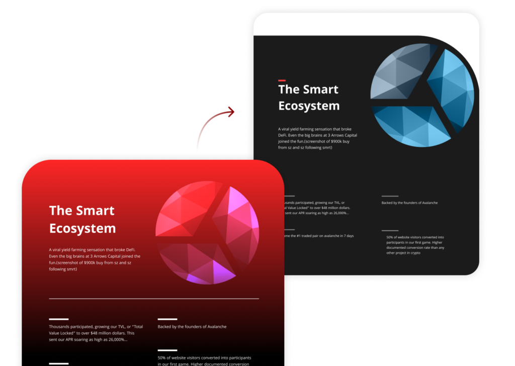
I rearrange some elements, play with forms and positions. Make red color more contract to keep it looks in good balance with black.
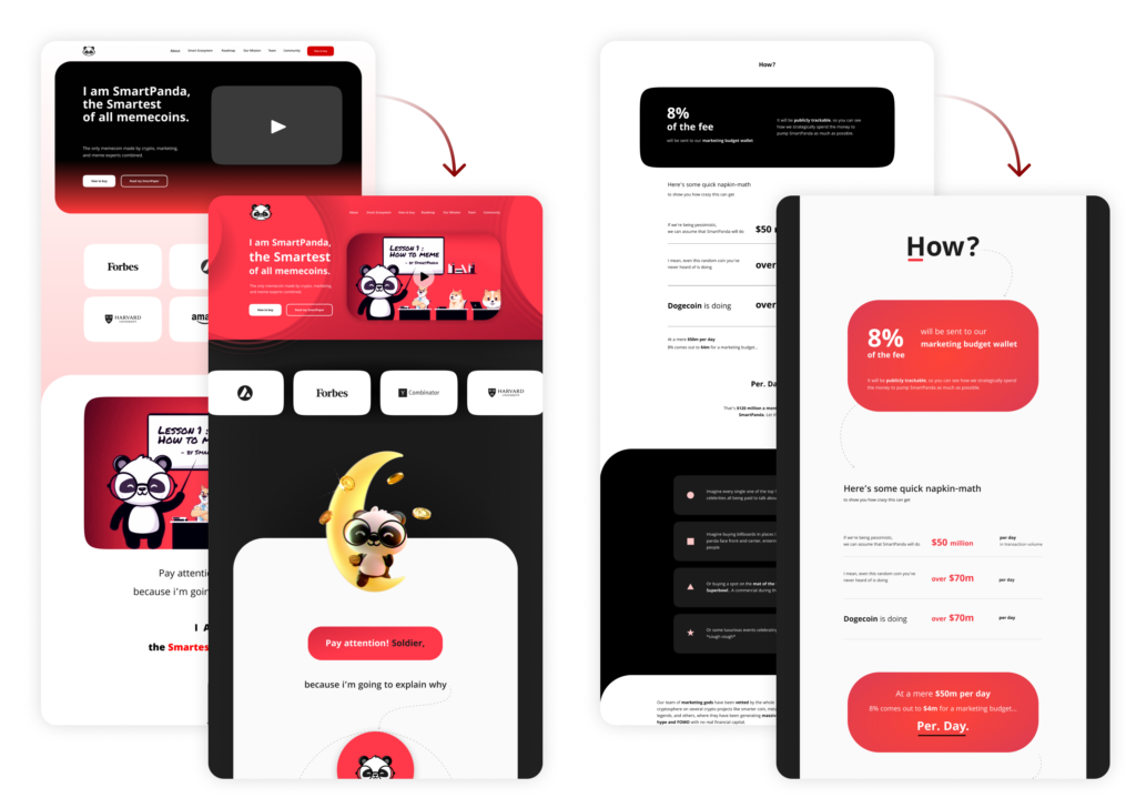
Page elements updated to consistent align.
“How to buy” steps rotated a bit to make this steps looks more attractive.
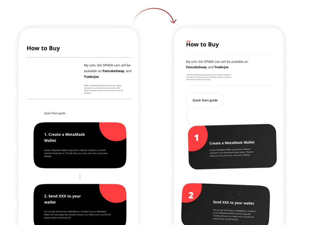
All text blocks create in one style with more readable text.
