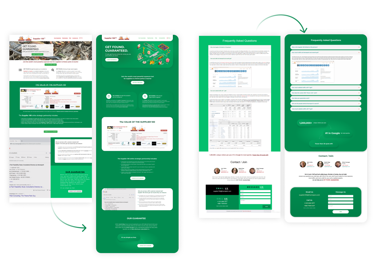
“Supplier 100” website redesign.
Client request to refresh site, make it looks more modern, but keep colors and all site content. Because it’s high ranked in search engines and any structural changes not accepted.
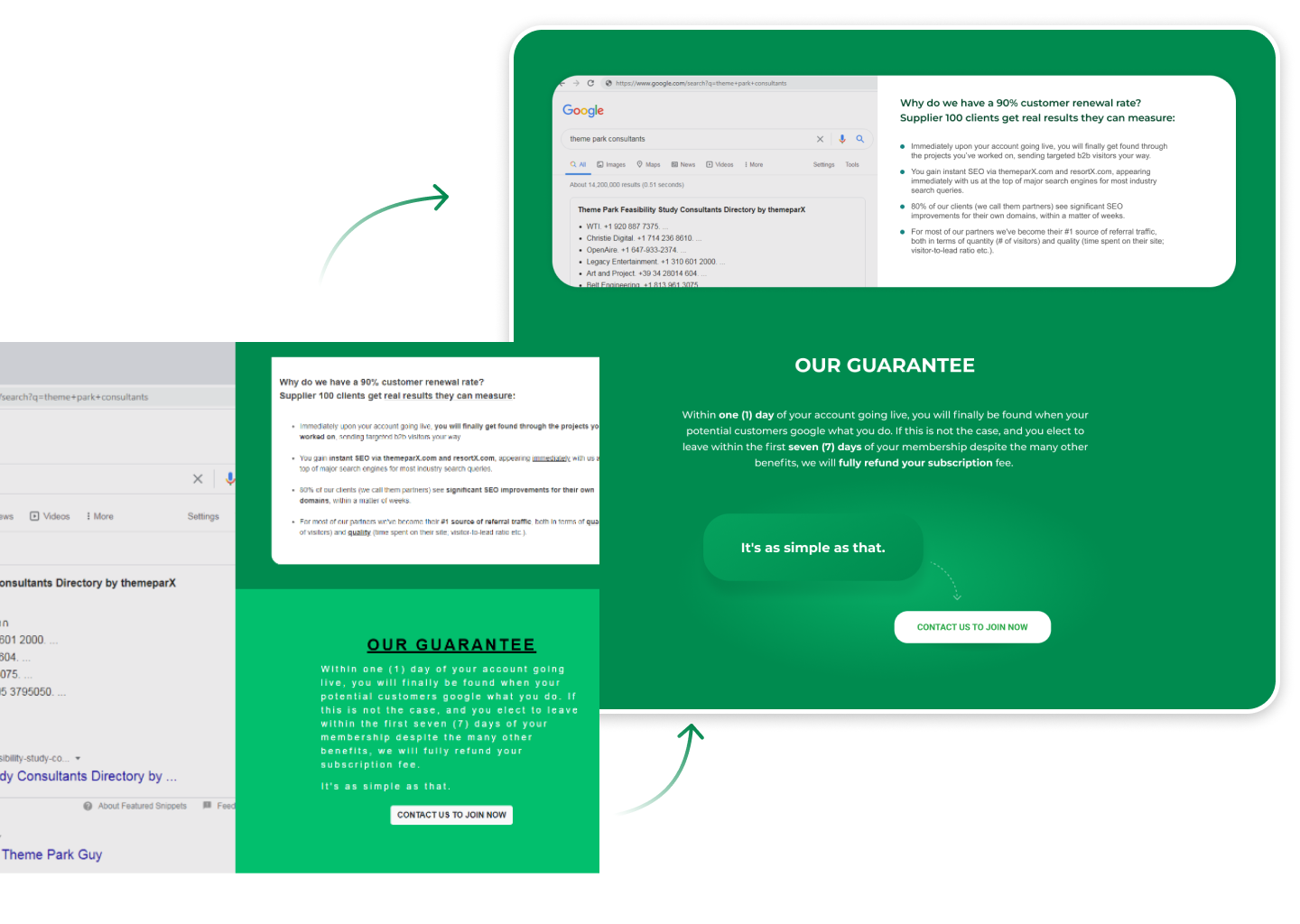
After review all content I decided replace hero image with new one more modern, enlarge distances between elements to give more space for users attention. Also reworked elements to make them looks clear and fresh:
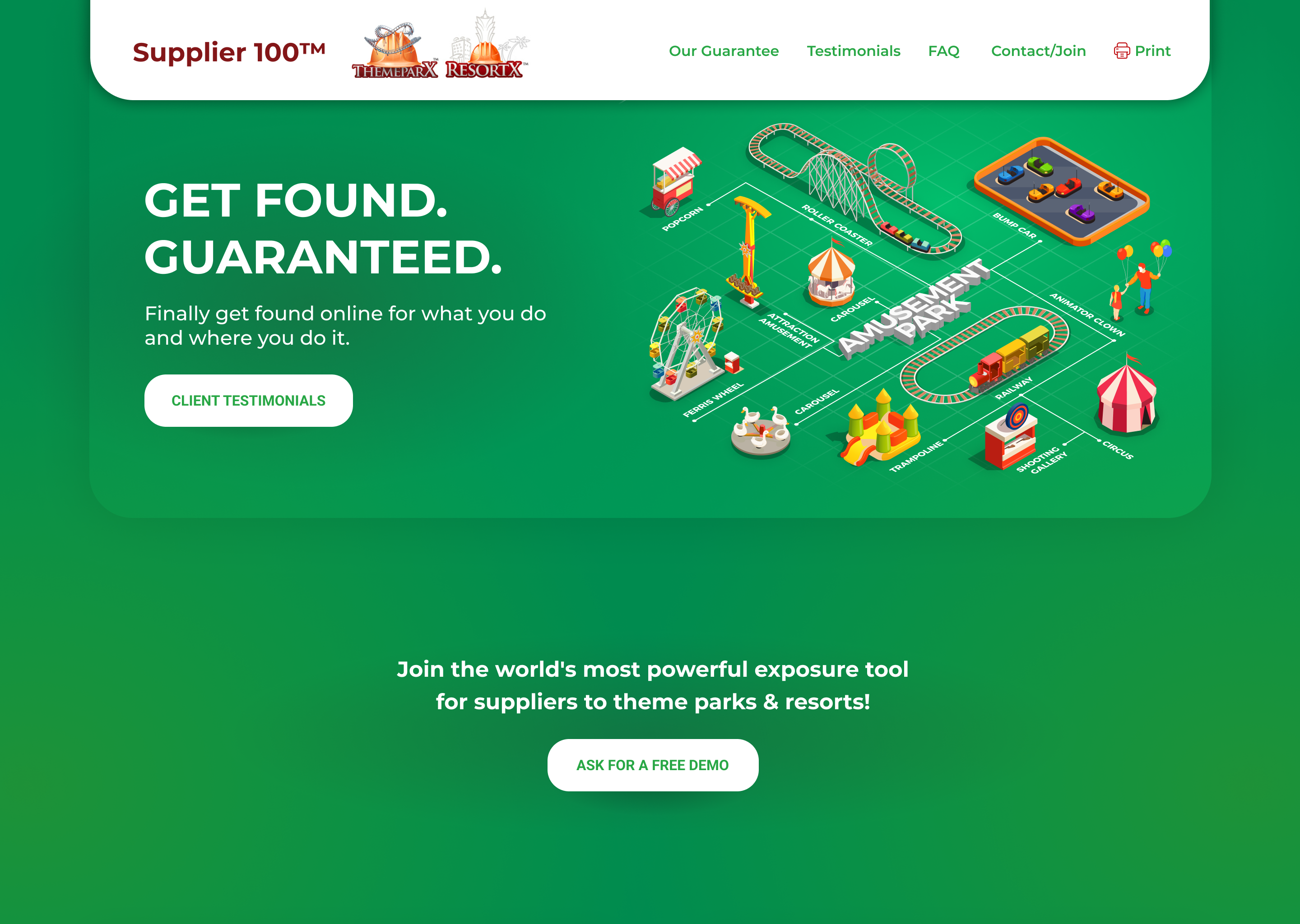
Hero image replaced with new, that represent “amusement park” business clearly:
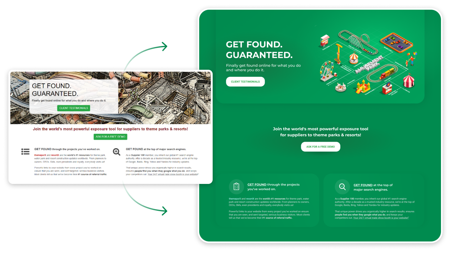
Content Blocks rearrange from check-board structure to inline:
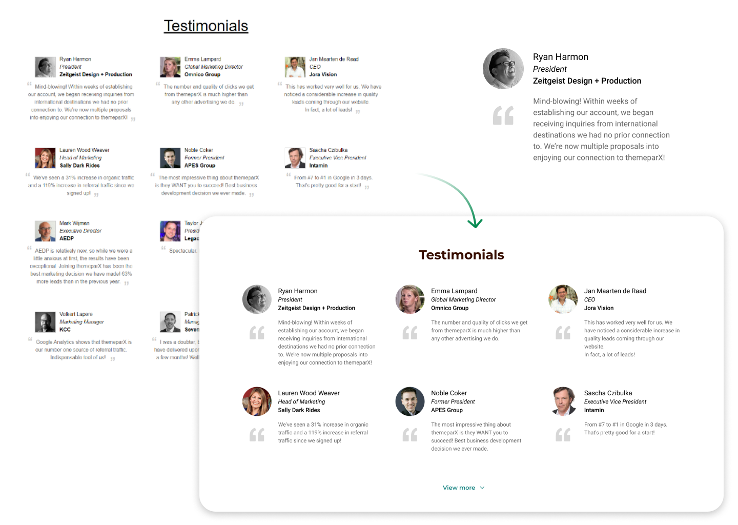
Testimonials section cleared up and shorten with possibility to load more. In this way we give to user faster way to scroll to a next section if this content not interested for him:
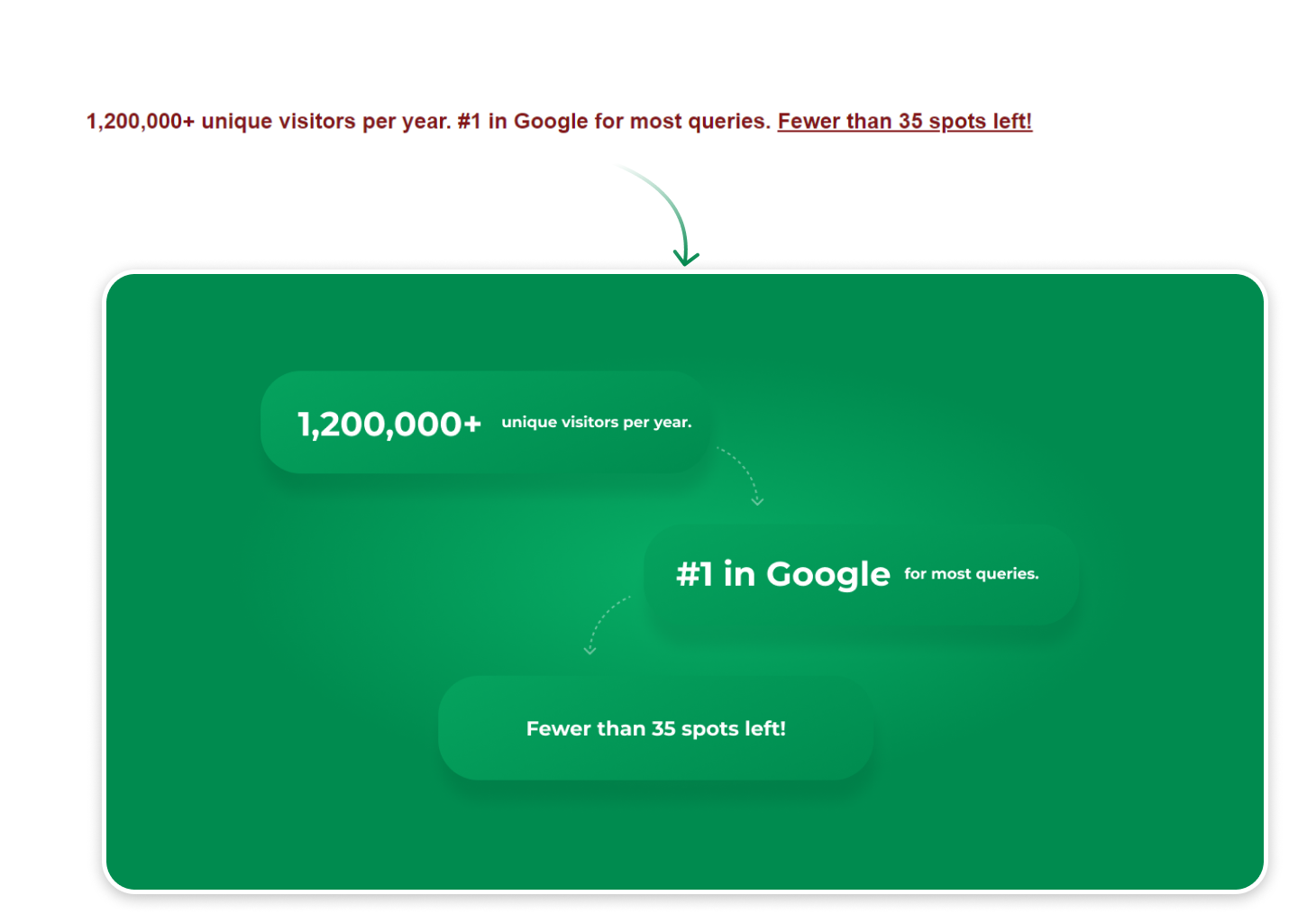
Ad elements redesigned from inline text to more interesting block to catch users attention:
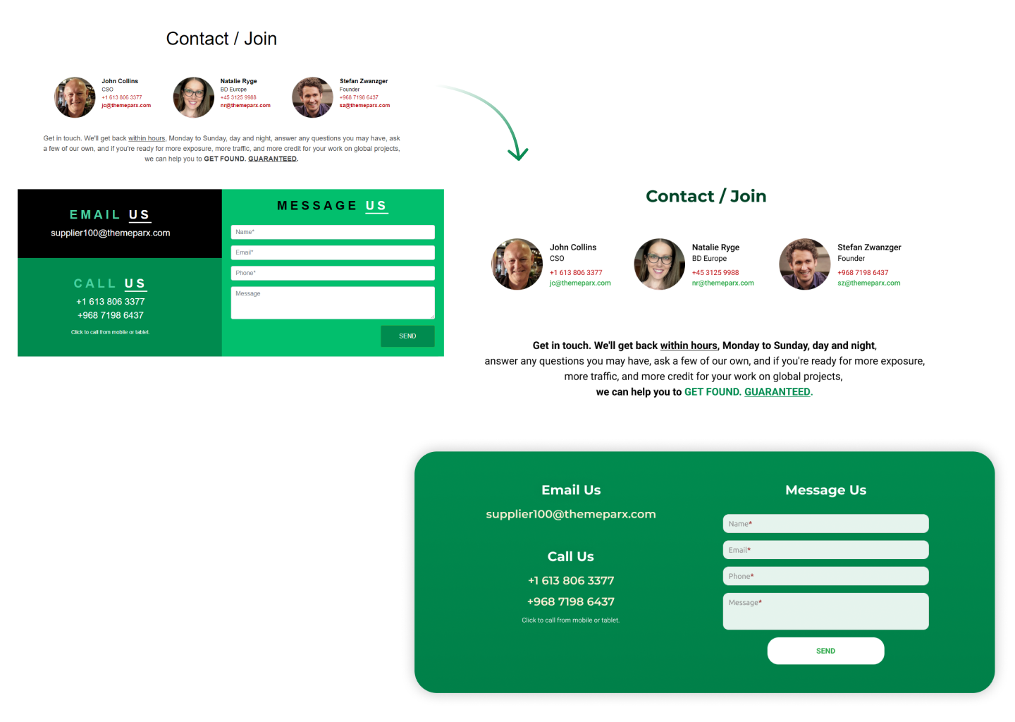
Contact section redesigned to clear view. In that way we show information to users in easier way:
